Introduction
Are you curious about which census tracts are the wealthiest in West Michigan? If you live in Kent, Muskegon, or Ottawa county, then this blog post is for you. We will be using R and a few libraries such as tidycensus, ggiraph, and tidyverseto create an interactive map that showcases the wealthiest census tracts in the selected counties. So, let’s dive in!
Requirements
Rstudio
R
Basic data modeling and R understanding
Mapping
First, let’s load the necessary libraries and set the options for tidycensus to use cache, which speeds up the process if we run the code again in the future. Then we will use the get_acs function from the tidycensus library to get the data we need. We will filter the data to only show the tracts where the estimate of the household income is over $80,000.
library(tidycensus)library(ggiraph)library(tidyverse)library(patchwork)library(scales)library(dplyr)options(tigris_use_cache = TRUE)vt_income <- get_acs( geography = "tract", variables = "B19013_001", state = "MI", county = c("Kent", "Ottawa", "Muskegon"), year = 2020, geometry = TRUE) %>% filter(estimate > 80000)
Now, let’s create the first plot, which will be a map of the selected counties in Michigan with the wealthiest census tracts highlighted. We will use ggplot2 to create this map, and the geom_sf_interactive function to make it interactive. We will also use the scale_fill_distiller function to set the color palette for the map, and the theme_void function to remove any unnecessary elements.
vt_map <- ggplot(vt_income, aes(fill = estimate)) + geom_sf_interactive(aes(data_id = GEOID)) + scale_fill_distiller(palette = "Greens", direction = 1, guide = "none") + theme_void()
Next, we will create the second plot, which will be a bar chart showing the distribution of household income by tract in the selected counties. We will use ggplot2 again, and the geom_errorbar and geom_point_interactive functions to show the margin of error. We will also use the scale_fill_distiller function to set the color palette for the plot, and the scale_x_continuous and scale_y_continuous functions to set the axis labels. Lastly, we will use the theme_minimal and theme functions to set the overall look as well as any adjustments to the y axis text.
vt_plot <- ggplot(vt_income, aes(x = estimate, y = reorder(NAME, estimate), fill = estimate)) + geom_errorbar(aes(xmin = estimate - moe, xmax = estimate + moe)) + geom_point_interactive(color = "black", size = 4, shape = 21, aes(data_id = GEOID)) + scale_fill_distiller(palette = "Greens", direction = 1, labels = label_dollar()) + scale_x_continuous(labels = label_dollar()) + labs(title = "Household income by tract in Michigan", subtitle = "2016-2020 American Community Survey", y = "", x = "ACS estimate (bars represent margin of error)", fill = "ACS estimate") + theme_minimal(base_size = 17) + theme(axis.text.y = element_text(size = 6, margin(0,0,10,0)))
Great! Now that we have our map and graph, let’s combine them using the patchwork package.
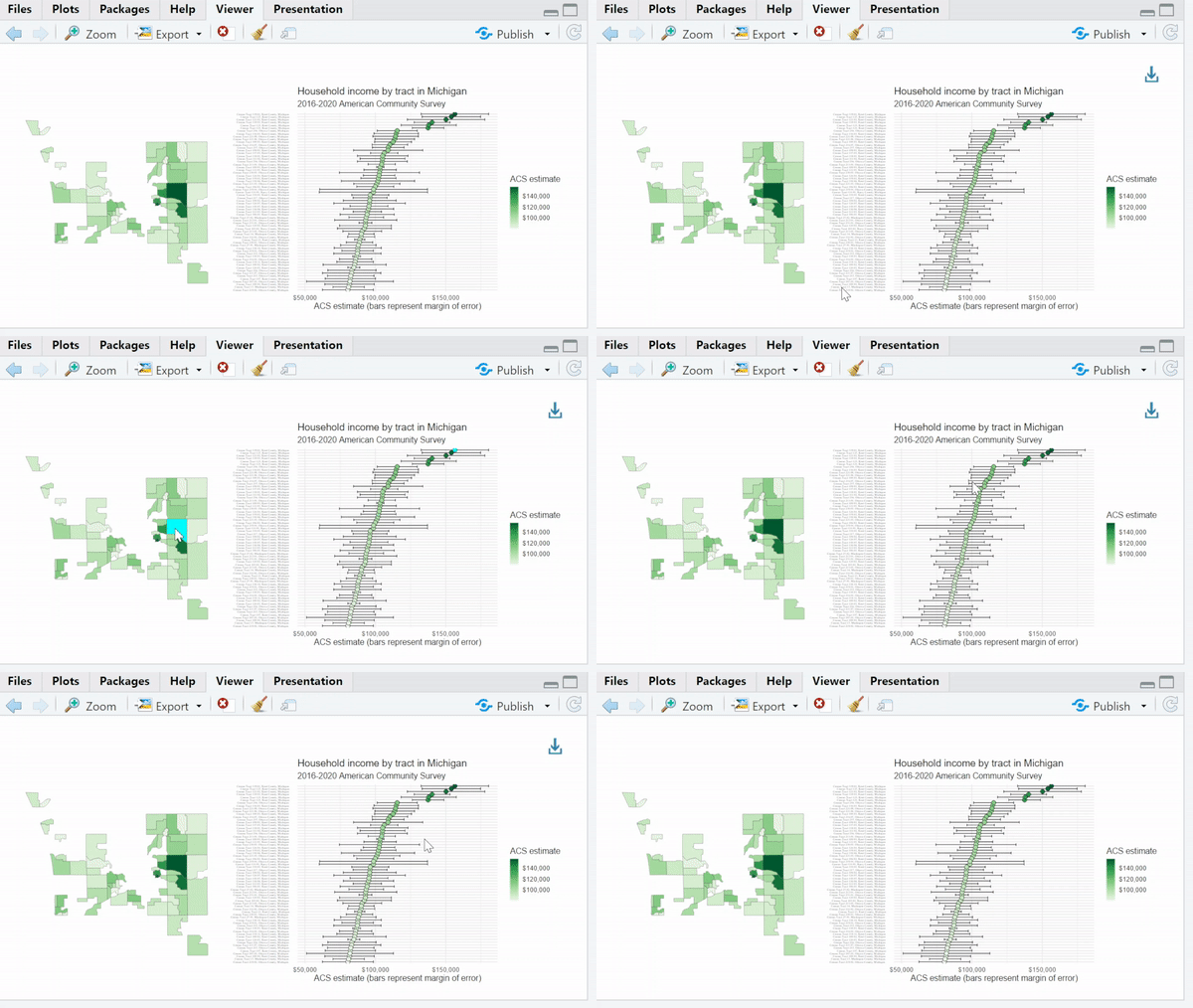
girafe(ggobj = vt_map + vt_plot, width_svg = 16, height_svg = 8) %>% girafe_options(opts_hover(css = "fill:cyan;"))
This code will give us an interactive plot where we can hover over each census tract to see its estimated household income. The girafe function converts our ggplot object into an interactive plot, and girafe_options allows us to customize the hover options. In this case, we change the fill color to cyan when hovering over a census tract.
And voilà! We have a beautiful and interactive visualization of the wealthiest census tracts in these Michigan counties.
Output:

Remarks
Not financial advice. You should seek a professional before making any financial decisions.